Insights Tab
The Insights tab provides a high-level, aggregated view of application usage across teams and time periods. It is designed to surface productivity patterns, highlight usage trends, and identify potential behavioral anomalies. Visuals in this tab focus on summarizing key metrics, including total active time, productive versus unproductive usage ratios, and team-level comparisons. By consolidating data into intuitive charts and summaries, this tab helps supervisors and analysts quickly assess overall performance, spot outliers, and guide deeper investigation where needed. Filters and drill-downs are available to refine the scope of analysis and tailor insights to specific teams, timeframes, or usage categories.
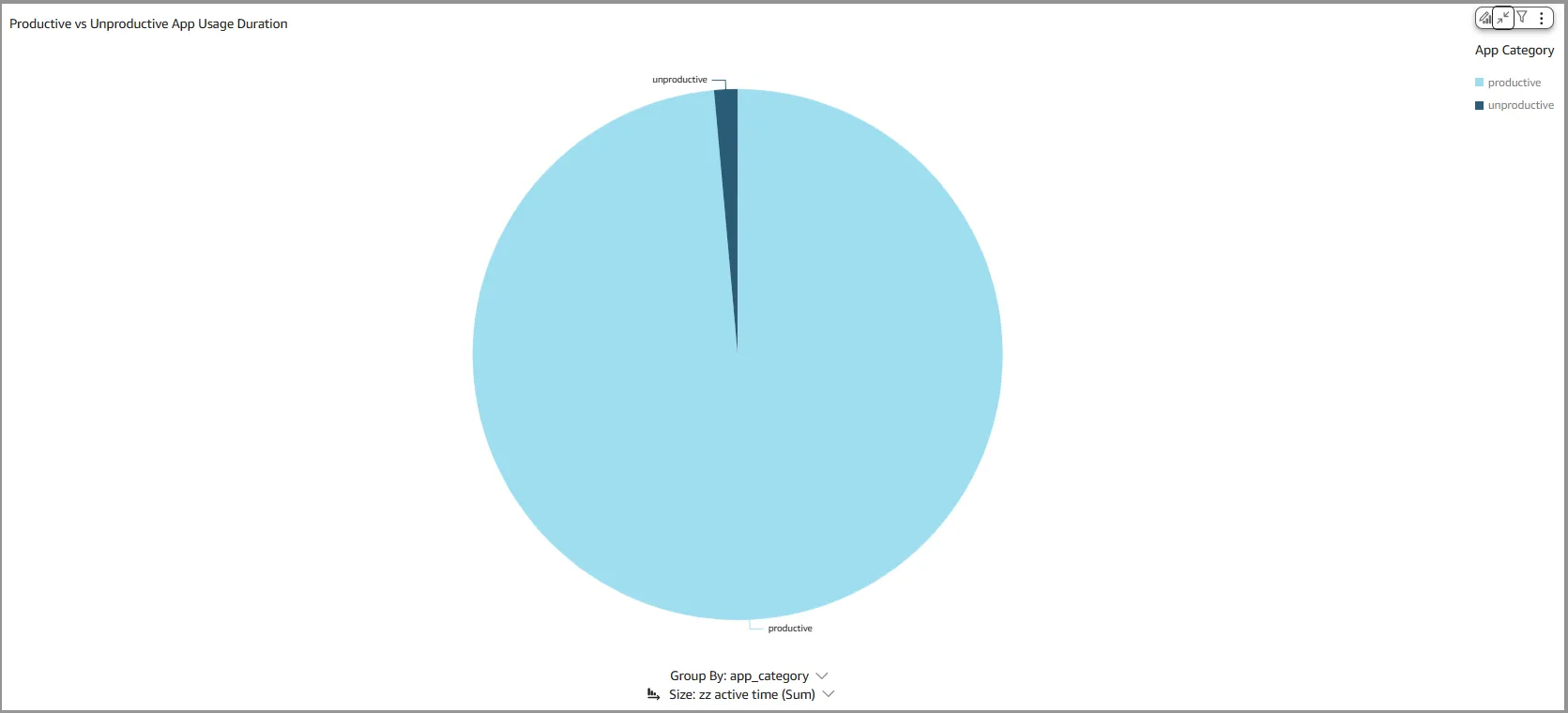
📅 Visual: Productive vs Unproductive App Usage Duration
The Productive vs Unproductive App Usage Duration pie chart displays the total application usage segmented by productivity category. The data is aggregated based on the selected teams and time period in Common Controls.
Uses
This pie chart provides a quick visual breakdown of total application usage, segmented into productive and unproductive categories. It helps supervisors and analysts assess overall productivity patterns at a glance, based on the selected teams and time period.
Drill-downs Supported
- App Category Drill Down - The app category is passed as a filter to the following visuals on this tab.
- Top Apps - Productive vs Unproductive - This visual updates to display application usage bars filtered by the selected app category. Each bar includes a tooltip that confirms the category being shown.
- App Usage Heatmap - By Date - The heatmap is updated to show usage only for the app category selected.
- App Usage Heatmap - By Hour of Day - The heatmap is updated to show usage only for the app category selected.
- Total Application Usage by Agent - The Sankey diagram visual is updated to show usage only for the app category selected.
- Unproductive Activity - By Team - This heatmap is updated to show usage only for the app category selected. If app category selected is 'productive', no data will be shown.
- Unproductive Activity - By Date - This heatmap is updated to show usage only for the app category selected. If app category selected is 'productive', no data will be shown.
- Total Productive Use % - The bar chart is updated to show only for the app category. However, since this visual requires both 'productive' and 'unproductive' categories, the results will not be meaningful when one app category is selected.
- Daily Productive vs Unproductive Usage - The bar chart is updated to show only for the app category. If 'unproductive' app category is chosen, the bar chart shows unproductive app usage with clarity
Tooltips
Tooltips are shown when the cursor is placed on any segment of the pie chart. The information shown includes;
- App Category - Show the app category for the selected segment
- Time (s)- Total time for the category
- Team - Team name. If multiple teams, then a '*' is shown
- Last Event - Shows the last time of occurrence of the event
💡 Tip: Since drill-downs filter data across visuals, tooltips help clarify the specific details being displayed.
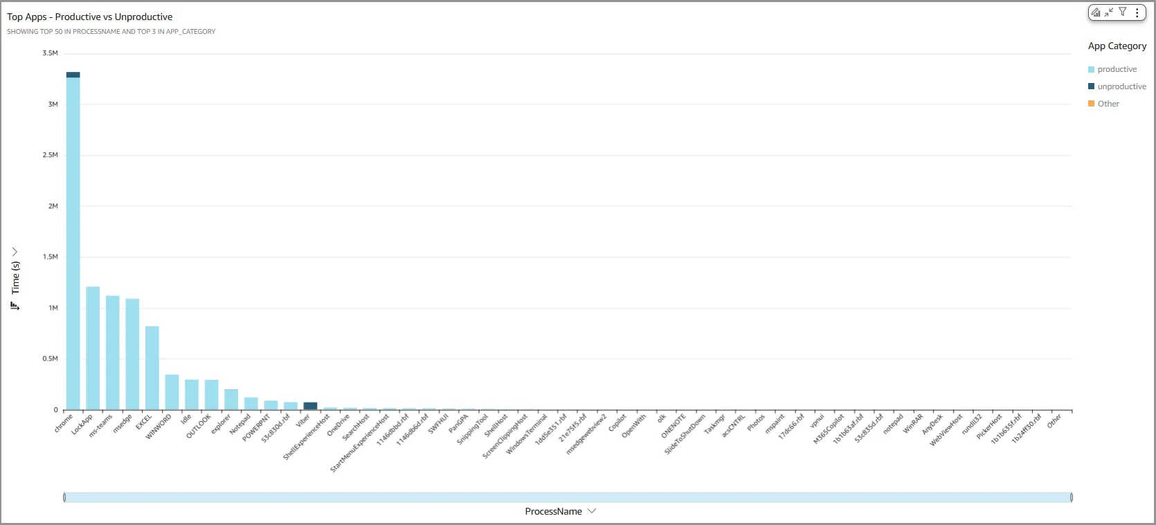
📅 Visual: Top Apps - Productive vs Unproductive
Top Apps - Productive vs Unproductive bar chart displays total usage time for each PC application, with individual bars representing apps. Each bar is segmented to show the proportion of productive versus unproductive usage, helping visualize how each application contributes to overall productivity. The data is aggregated based on the selected teams and time period in Common Controls.
Uses
This bar chart helps visualize how each application is used, distinguishing between productive and unproductive usage. It supports quick comparisons across apps, making it easier to identify which apps contribute most to overall efficiency or distraction.
Drill-downs Supported
- App Name Drill Down - The app name is passed as a filter to the following visuals on this tab.
- Productive vs Unproductive App Usage Duration - This visual updates to show usage data for the selected application only. Each segment within the pie chart represents the corresponding productivity category—productive or unproductive.
- App Usage Heatmap - By Date - The heatmap is updated to show usage only for the app selected.
- App Usage Heatmap - By Hour of Day - The heatmap is updated to show usage only for the app selected.
- App Usage Heatmap - By Team - The heatmap is updated to show usage only for the app selected
- Total Application Usage by Agent - The Sankey diagram visual is updated to show usage only for the app selected.
- Unproductive Activity - By Team - This heatmap is updated to show usage only for the app selected. If the app does not have any unproductive use, the visual will not show any data.
- Unproductive Activity - By Date - This heatmap is updated to show usage only for the app selected. If the app does not have any unproductive use, the visual will not show any data.
- Total Productive Use % - The bar chart is updated to show productive usage for the app selected.
- Daily Productive vs Unproductive Usage - The bar chart is updated to show only the selected app. If the app is used for unproductive activity, the nature of unproductive usage is shown on the chart.
Tooltips
Tooltips are shown when the cursor is placed on any segment of the bar chart. The information shown includes;
- App Name - Shows the name of the app
- App Category - Shows the segment app category
- Team - Team name. If multiple teams, then a '*' is shown
- Time (s)- Total time for the category
- Last Event - Shows the last time of occurrence of the event
💡 Tip: Since drill-downs filter data across visuals, tooltips help clarify the specific details being displayed.
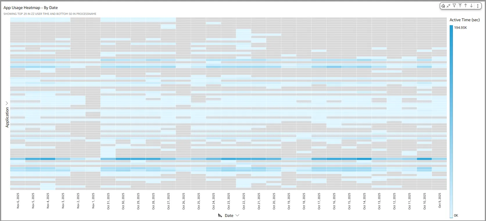
📅 Visual: App Usage Heatmap - By Date
App Usage Heatmap - By Date heatmap displays total application usage in seconds across all tracked apps. Each row represents a specific application, while each column corresponds to a time unit—by default, one day. Individual cells show the usage duration for each app within the selected time frame. The displayed data is filtered based on the time period and usage category defined in the Common Controls.
💡 Tip: To better view detailed usage per app, maximize the visual using the top-right menu options.
Uses
This heatmap is especially valuable for supervisors and analysts seeking to compare relative application usage over time. It makes it easy to spot changes in usage over time and identify time-based patterns or anomalies in behavior.
Drill-downs Supported
- Time Unit Drill Down - The time unit for each heatmap column—by default, a single date—is passed as a filter to the subsequent visuals on this tab.
- Productive vs Unproductive App Usage Duration - This visual updates to show usage data for the selected time unit only. Each segment within the pie chart represents the corresponding productivity category—productive or unproductive.
- Top Apps - Productive vs Unproductive - This visual updates to display application usage bars filtered by the selected time unit. Each bar includes a tooltip that confirms the date/time unit being shown.
- App Usage Heatmap - By Hour of Day - The heatmap is updated to show usage only for the selected time unit. The tooltip shows the time unit selected.
- App Usage Heatmap - By Team - The heatmap is updated to show usage only for the time unit selected. The tooltip shows the time unit selected.
- Total Application Usage by Agent - The Sankey diagram visual is updated to show usage only for the app time unit.
- Unproductive Activity - By Team - This heatmap is updated to show usage only for the selected time unit. The tooltip shows the time unit selected.
- Unproductive Activity - By Date - This heatmap is updated to show usage only for the app selected. If the app does not have any unproductive use, the visual will not show any data.
- Total Productive Use % - The bar chart is updated to show productive usage for the selected time unit.
- Daily Productive vs Unproductive Usage - The bar chart is updated to show only the selected time unit. The tooltip shows the time unit selected.
- Time Drill Up/Down - Time-based drill-ups and drill-downs can be accessed via the visual menu located in the top-right corner of the chart.
Tooltips
Tooltips are shown when the cursor is placed on any cell of the heatmap. The information shown includes;
- Date - Shows the date for the start of the time unit
- Application - Shows the name of the application
- Time (s)- Total time for the category
- Team - Team name. If multiple teams, then a '*' is shown
- Last Event - Shows the last time of occurrence of the event
💡 Tip: Since drill-downs filter data across visuals, tooltips help clarify the specific details being displayed.
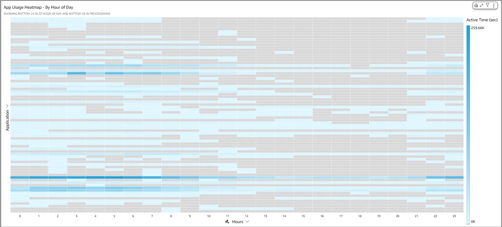
📅 Visual: App Usage Heatmap - By Hour of Day
App Usage Heatmap - By Hour of Day heatmap displays total application usage in seconds across all tracked apps. Each row represents a specific application, while each column corresponds to an hour of the day. Individual cells show the aggregated usage duration for each app within that hour, summed across the selected time period. The data is filtered based on the time range and usage category defined in the Common Controls.
💡 Tip: To better view detailed usage per app, maximize the visual using the top-right menu options.
Uses
This heatmap visual is especially valuable for supervisors and analysts aiming to compare application usage patterns across different times of day. It helps reveal when specific apps are most frequently used—whether during morning hours, lunch breaks, or other time blocks—making it easier to identify behavioral trends.
Drill-downs Supported
- Hour Drill Down - The hour of the day is passed as a filter to the subsequent visuals on this tab.
- Productive vs Unproductive App Usage Duration - This visual updates to show usage data aggregated for the selected hour of the day. Each segment within the pie chart represents the corresponding productivity category—productive or unproductive.
- Top Apps - Productive vs Unproductive - This visual updates to display application usage bars aggregated for the selected hour of the day. Each bar includes a tooltip that confirms the date/time unit being shown.
- App Usage Heatmap - By Date - The heatmap is updated to show usage aggregated only for the selected hour of the day. The tooltip shows the date/time selected.
- App Usage Heatmap - By Team - The heatmap is updated to show usage aggregated only for the selected hour of the day. The tooltip shows the date/time selected.
- Total Application Usage by Agent - The Sankey diagram visual is updated and aggregated only for the selected hour of the day.
- Unproductive Activity - By Team - This heatmap is updated to show usage aggregated only for the selected hour of the day. The tooltip shows the date/time selected.
- Unproductive Activity - By Date - This heatmap is updated to show usage aggregated only for the selected hour of the day. If the hour does not have any unproductive use, the visual will not show any data.
- Total Productive Use % - The bar chart is updated to show productive usage for the selected hour of the day.
- Daily Productive vs Unproductive Usage - The bar chart is updated to show usage data aggregated only for the selected hour of the day.
Tooltips
Tooltips are shown when the cursor is placed on any cell of the heatmap. The information shown includes;
- Hour of the Day - Shows the hour of the day
- Application - Shows the name of the application
- Time (s)- Total time for the category
- Team - Team name. If multiple teams, then a '*' is shown
- Last Event - Shows the last time of occurrence of the event
💡 Tip: Since drill-downs filter data across visuals, tooltips help clarify the specific details being displayed.
📅 Visual: App Usage Heatmap - By Team
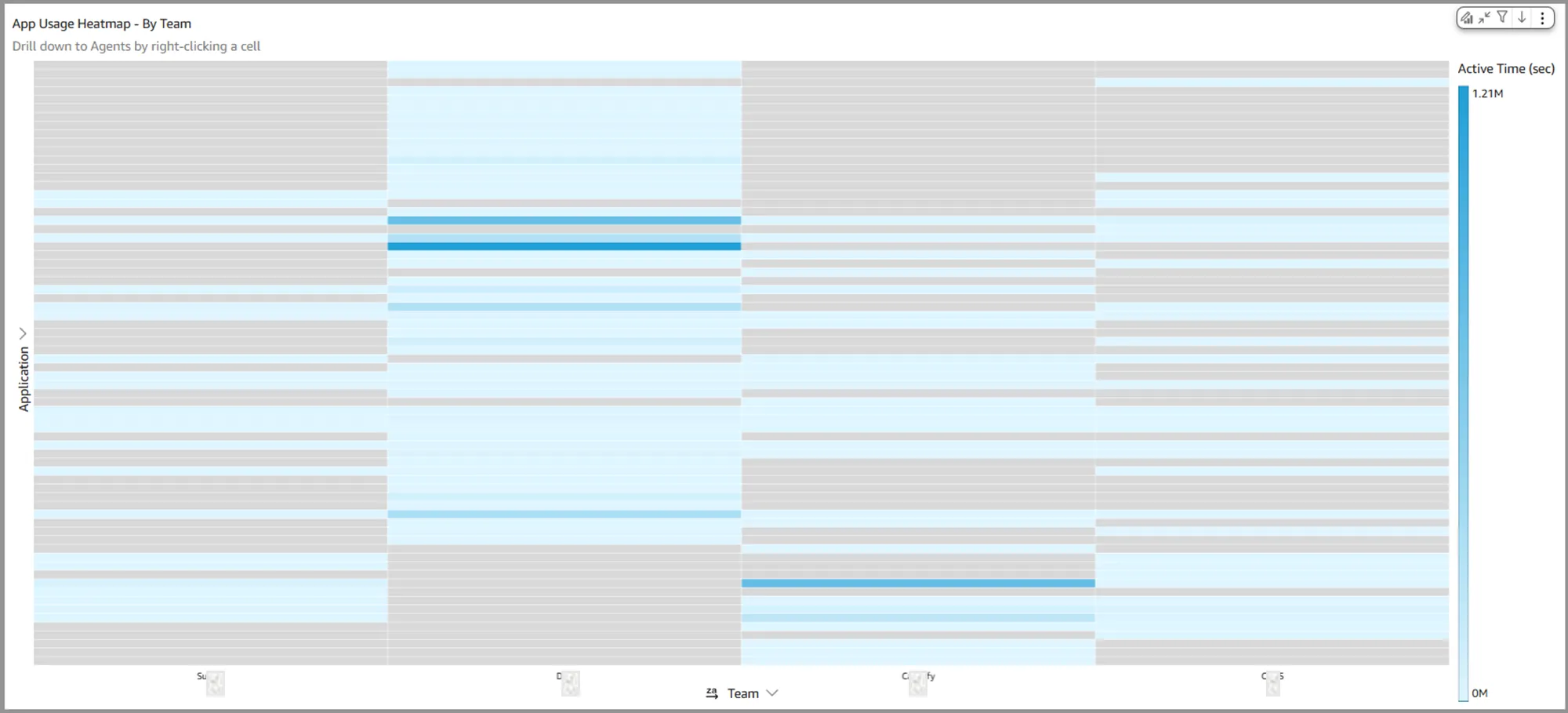
App Usage Heatmap - By Team heatmap displays total application usage in seconds across all tracked apps. Each row represents a specific application, while each column corresponds to a team (or agent). Individual cells show the aggregated usage duration for each app for the team (or agent), summed across the selected time period. The data is filtered based on the time range and usage category defined in the Common Controls.
Agent Drill Down - This visual supports drilldowns to agent-level usage details. Right-clicking a cell opens a menu with the option to drill down to agents in the team.
💡 Tip: To better view detailed usage per app, maximize the visual using the top-right menu options.
Uses
This heatmap visual is especially valuable for supervisors and analysts aiming to compare application usage patterns across teams (or agents). It helps compare the preferences of apps across teams.
Drill-downs Supported
- Team/agent Drill Down - The team name (or agent name) is passed as a filter to the subsequent visuals on this tab.
- Productive vs Unproductive App Usage Duration - This visual updates to show usage data for the selected team or agent. Each segment within the pie chart represents the corresponding productivity category—productive or unproductive.
- Top Apps - Productive vs Unproductive - This visual updates to display application usage bars for the selected team or agent. Each bar includes a tooltip that confirms the team or agent being shown.
- App Usage Heatmap - By Date - The heatmap is updated to show usage for the selected team or agent. The tooltip shows the selected team and agent.
- App Usage Heatmap - By Hour of Day - The heatmap is updated to show usage for the selected team or agent. The tooltip shows the selected team and agent.
- Total Application Usage by Agent - The Sankey diagram visual is updated to show usage for the selected team or agent.
- Unproductive Activity - By Team - This heatmap is updated to show usage for the selected team or agent. If the team or agent did not have unproductive use, the visual will not show any data.
- Unproductive Activity - By Date - This heatmap is updated to show usage for the selected team or agent. If the team or agent did not have unproductive use, the visual will not show any data.
- Total Productive Use % - The bar chart is updated to show productive usage for the selected team or agent.
- Daily Productive vs Unproductive Usage - The bar chart is updated to show usage for the selected team or agent.
Tooltips
Tooltips are shown when the cursor is placed on any cell of the heatmap. The information shown includes;
- Team or Agent - Name of the team or the agent
- Application - Shows the name of the application
- Time (s)- Total time for the category
- Team - Team name. If multiple teams, then a '*' is shown
- Last Event - Shows the last time of occurrence of the event
💡 Tip: Since drill-downs filter data across visuals, tooltips help clarify the specific details being displayed.
📅 Visual: Total Application Usage by Agent
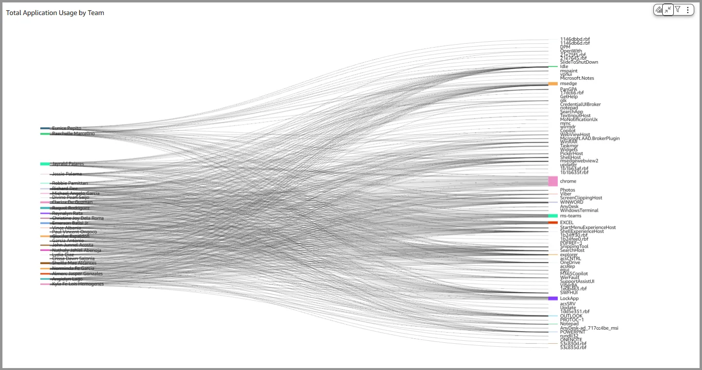
Total Application Usage by Agent Sankey Diagram visual maps each agent to the applications they have used, illustrating the flow and volume of usage across individuals and apps. It highlights usage patterns at the agent level, making it easy to identify which applications are most frequently accessed and by whom.
💡 Tip: To better view detailed usage per app, maximize the visual using the top-right menu options. Also, the view may have to be filtered down to the level of a team or an agent to see useful information
Uses
This Sankey Diagram highlights usage patterns at the agent level, making it easy to identify which applications are most frequently accessed and by whom.
Drill-downs Supported
Drill-downs are not supported on Sankey Diagrams
Tooltips
Tooltips are shown when the cursor is placed on an individual flow line. The information shown includes;
- Agent to Application name
- Total usage in seconds
📅 Visual: Unproductive Activity - By Team
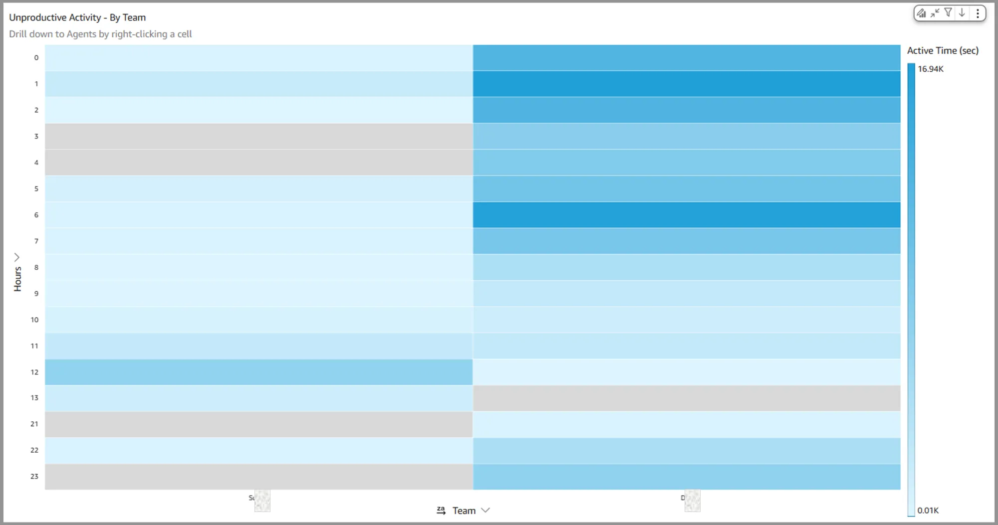
App Usage Heatmap - By Team visual displays total unproductive application usage in seconds, broken down by team (or agent) across specific hours of the day. Each cell represents the aggregated unproductive usage for a given team and hour, summed over the selected time period.
Agent Drill Down - This visual supports drilldowns to agent-level usage details. Right-clicking a cell opens a menu with the option to drill down to agents in the team.
💡 Tip: To better view detailed usage per app, maximize the visual using the top-right menu options.
Uses
This visual helps identify when and with whom unproductive behaviors are most concentrated, enabling targeted coaching and workflow adjustments.
Drill-downs Supported
- Team/agent Drill Down - The team name (or agent name) is passed as a filter to the subsequent visuals on this tab.
- Productive vs Unproductive App Usage Duration - This visual updates to show usage data for the selected team or agent. Each segment within the pie chart represents the corresponding productivity category—productive or unproductive.
- Top Apps - Productive vs Unproductive - This visual updates to display application usage bars for the selected team or agent. Each bar includes a tooltip that confirms the team or agent being shown.
- App Usage Heatmap - By Date - The heatmap is updated to show usage for the selected team or agent. The tooltip shows the selected team and agent.
- App Usage Heatmap - By Hour of Day - The heatmap is updated to show usage for the selected team or agent. The tooltip shows the selected team and agent.
- App Usage Heatmap - By Team - This heatmap is updated to show usage for the selected team or agent. If the team or agent did not have unproductive use, the visual will not show any data.
- Total Application Usage by Agent - The Sankey diagram visual is updated to show usage for the selected team or agent.
- Unproductive Activity - By Date - This heatmap is updated to show usage for the selected team or agent. If the team or agent did not have unproductive use, the visual will not show any data.
- Total Productive Use % - The bar chart is updated to show productive usage for the selected team or agent.
- Daily Productive vs Unproductive Usage - The bar chart is updated to show usage for the selected team or agent.
Tooltips
Tooltips are shown when the cursor is placed on any cell of the heatmap. The information shown includes;
- Team or Agent - Name of the team or the agent
- Hour - Shows the hour of the day
- Time (s)- Total time for the category
- Application - Shows the unproductive app usage for that hour. If multiple apps had unproductive usage during this hour, a '*' is shown.
- Team - Team name. If multiple teams, then a '*' is shown
- Last Event - Shows the last time of occurrence of the event
💡 Tip: Since drill-downs filter data across visuals, tooltips help clarify the specific details being displayed.
📅 Visual: Unproductive Activity - By Date
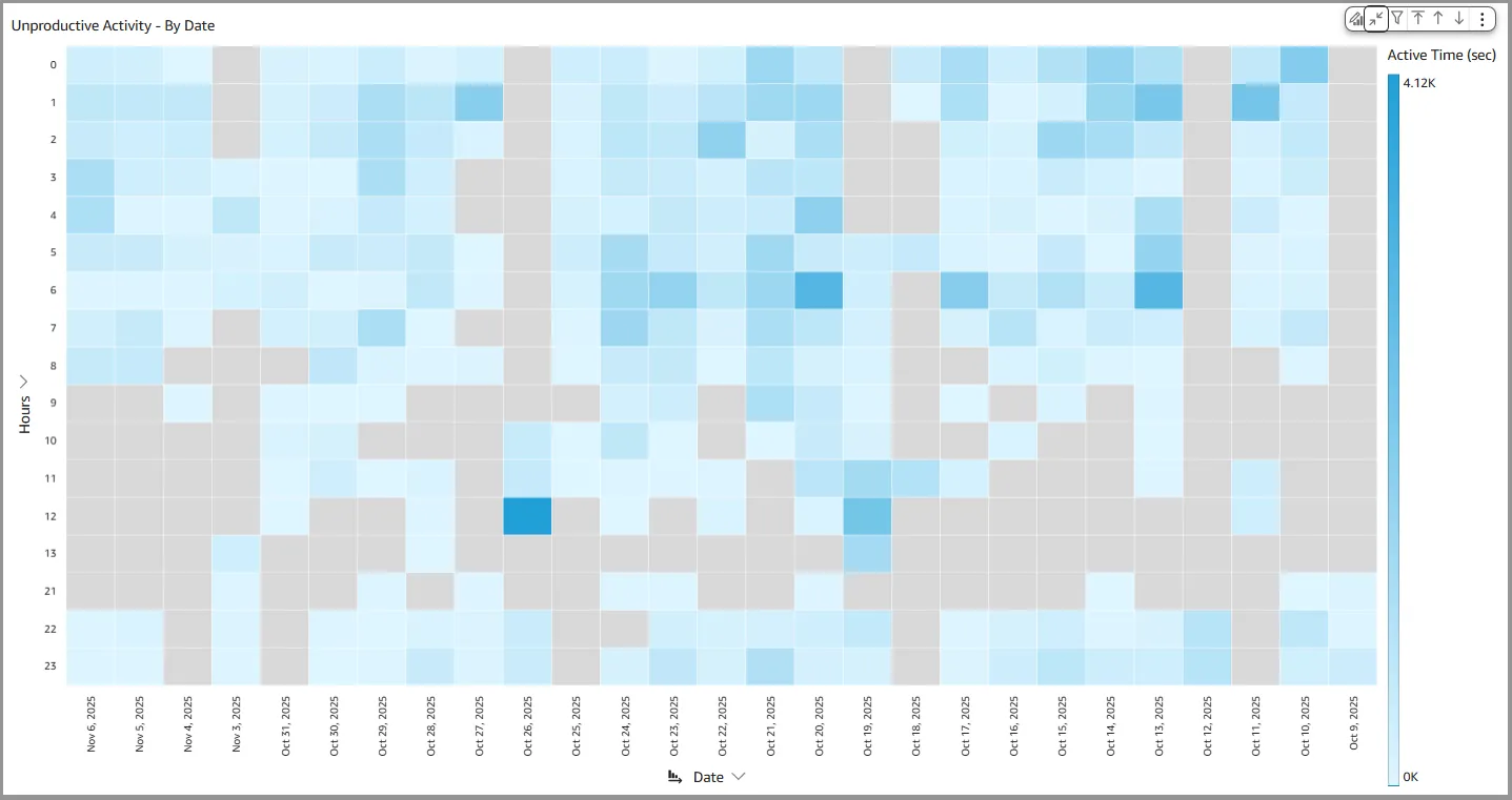
App Usage Heatmap - By Team heatmap visual displays total unproductive application usage in seconds, organized by hour across days or the chosen aggregated time unit. Each cell represents the total aggregated usage for the specific hour on the date or the aggregated time unit.
💡 Tip: To better view detailed usage per app, maximize the visual using the top-right menu options.
Uses
This visual helps supervisors and analysts identify when unproductive behaviors are most concentrated across time blocks and dates. It supports targeted coaching, workflow adjustments, and deeper analysis of time-based usage patterns.
Drill-downs Supported
- Time Unit Drill Down - The time unit for each heatmap column—by default, a single date—is passed as a filter to the subsequent visuals on this tab.
- Productive vs Unproductive App Usage Duration - This visual updates to show usage data for the selected time unit only. Each segment within the pie chart represents the corresponding productivity category—productive or unproductive.
- Top Apps - Productive vs Unproductive - This visual updates to display application usage bars filtered by the selected time unit. Each bar includes a tooltip that confirms the date/time unit being shown.
- App Usage Heatmap - By Date - The heatmap is updated to show usage only for the selected time unit. The tooltip shows the time unit selected.
- App Usage Heatmap - By Hour of Day - The heatmap is updated to show usage only for the selected time unit. The tooltip shows the time unit selected.
- App Usage Heatmap - By Team - The heatmap is updated to show usage only for the time unit selected. The tooltip shows the time unit selected.
- Total Application Usage by Agent - The Sankey diagram visual is updated to show usage only for the app time unit.
- Unproductive Activity - By Team - This heatmap is updated to show usage only for the selected time unit. The tooltip shows the time unit selected.
- Total Productive Use % - The bar chart is updated to show productive usage for the selected time unit.
- Daily Productive vs Unproductive Usage - The bar chart is updated to show only the selected time unit. The tooltip shows the time unit selected.
- Time Drill Up/Down - Time-based drill-ups and drill-downs can be accessed via the visual menu located in the top-right corner of the chart.
Tooltips
Tooltips are shown when the cursor is placed on any cell of the heatmap. The information shown includes;
- Date - Shows the date for the start of the time unit
- Hour - Hour of the day
- Application - Shows the name of the application
- Time (s)- Total time for the category
- Team - Team name. If multiple teams, then a '*' is shown
- Last Event - Shows the last time of occurrence of the event
💡 Tip: Since drill-downs filter data across visuals, tooltips help clarify the specific details being displayed.
📅 Visual: Total Productive Use %
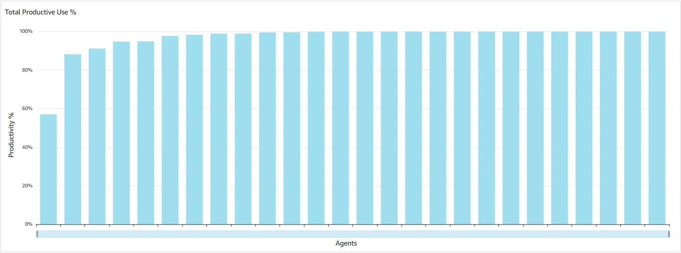
Total Productive Use % bar chart displays the percentage of productive application usage for each agent. This metric is calculated by dividing the time of productive application usage by the total application usage time while the agent is logged in, offering a straightforward view of agent efficiency.
Uses
This visual is sorted to highlight agents with the lowest productivity percentages on the left, making them easy to identify. Supervisors and analysts can use this insight to drill down further and uncover potential coaching needs or opportunities for workflow optimization.
Drill-downs Supported
- Agent Drill Down - The agent name is passed as a filter to the subsequent visuals on this tab.
- Productive vs Unproductive App Usage Duration - This visual updates to show usage data for the selected agent. Each segment within the pie chart represents the corresponding productivity category—productive or unproductive.
- Top Apps - Productive vs Unproductive - This visual updates to display application usage bars for the selected agent. Each bar includes a tooltip that confirms the agent being shown.
- App Usage Heatmap - By Date - The heatmap is updated to show usage for the selected agent. The tooltip shows the selected agent.
- App Usage Heatmap - By Hour of Day - The heatmap is updated to show usage for the selected agent. The tooltip shows the selected agent.
- App Usage Heatmap - By Team - This heatmap is updated to show usage for the selected agent. If the agent did not have unproductive use, the visual will not show any data.
- Total Application Usage by Agent - The Sankey diagram visual is updated to show usage for the selected agent.
- Unproductive Activity - By Team - This heatmap is updated to show usage for the selected agent. If the agent did not have unproductive use, the visual will not show any data.
- Unproductive Activity - By Date - This heatmap is updated to show usage for the selected agent. If the agent did not have unproductive use, the visual will not show any data.
- Daily Productive vs Unproductive Usage - The bar chart is updated to show usage for the selected agent.
Tooltips
Tooltips are shown when the cursor is placed on any bar. The information shown includes;
- Agent - Name of the team or the agent
- Productivity % - Shows productivity for the agent
- Application - Shows the unproductive app usage for that hour. If multiple apps had unproductive usage during this hour, a '*' is shown.
- Team - Team name. If multiple teams, then a '*' is shown
- Last Event - Shows the last time of occurrence of the event
💡 Tip: Since drill-downs filter data across visuals, tooltips help clarify the specific details being displayed.
📅 Visual: Daily Productive vs Unproductive Usage
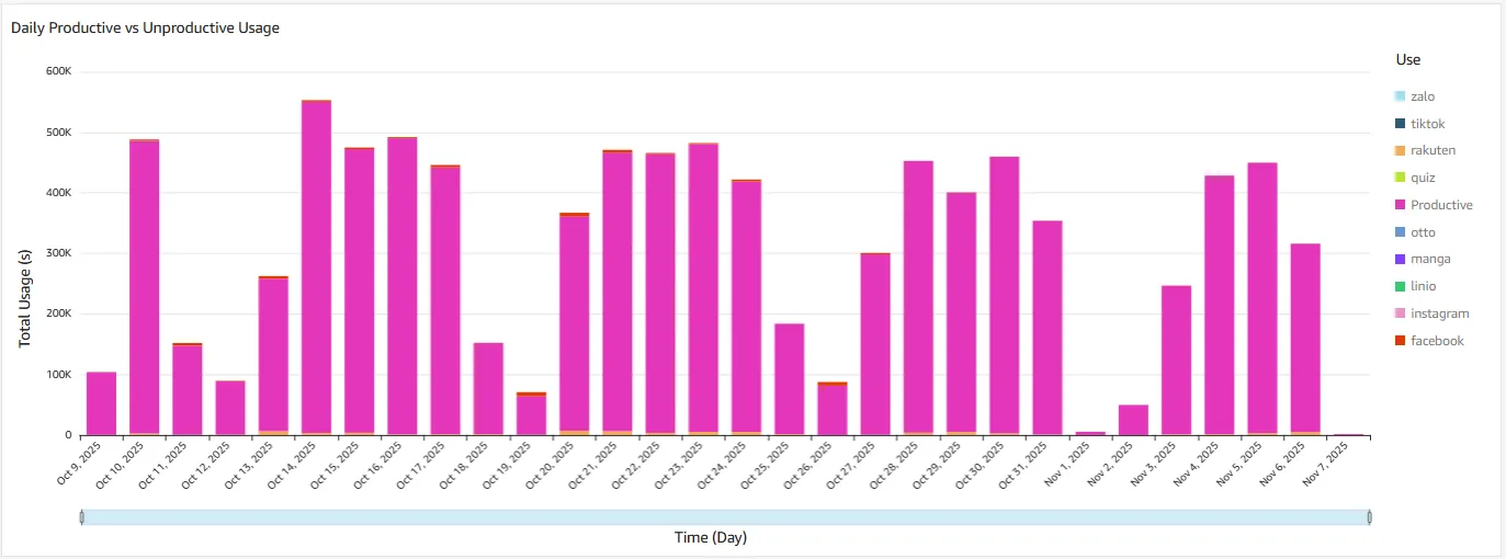
Daily Productive vs Unproductive Usage bar chart presents total daily application usage, segmented into productive and unproductive categories. Each unproductive application is shown as a separate segment within the bar, offering a detailed view of how time was spent each day. The displayed data reflects the teams and aggregation period defined in the Common Controls.
💡 Tip: Select 'unproductive' as the category from the App Category filter in the Common Controls to see unproductive application usage in more detail.
Uses
This visual offers a quick snapshot of daily productivity aggregated across teams or the entire organization. Unproductive application usage is clearly surfaced, enabling fast identification and deeper drilldown where needed.
Drill-downs Supported
- Time Unit Drill Down - The time unit from the bar—by default, a single date—is passed as a filter to the subsequent visuals on this tab.
- Productive vs Unproductive App Usage Duration - This visual updates to show usage data for the selected time unit only. Each segment within the pie chart represents the corresponding productivity category—productive or unproductive.
- Top Apps - Productive vs Unproductive - This visual updates to display application usage bars filtered by the selected time unit. Each bar includes a tooltip that confirms the date/time unit being shown.
- App Usage Heatmap - By Date - The heatmap is updated to show usage only for the selected time unit. The tooltip shows the time unit selected.
- App Usage Heatmap - By Hour of Day - The heatmap is updated to show usage only for the selected time unit. The tooltip shows the time unit selected.
- App Usage Heatmap - By Team - The heatmap is updated to show usage only for the time unit selected. The tooltip shows the time unit selected.
- Total Application Usage by Agent - The Sankey diagram visual is updated to show usage only for the app time unit.
- Unproductive Activity - By Team - This heatmap is updated to show usage only for the selected time unit. The tooltip shows the time unit selected.
- Unproductive Activity - By Date - This heatmap is updated to show usage only for the selected time unit. The tooltip shows the time unit selected.
- Total Productive Use % - The bar chart is updated to show productive usage for the selected time unit.
- Time Drill Up/Down - Time-based drill-ups and drill-downs can be accessed via the visual menu located in the top-right corner of the chart.
Tooltips
Tooltips are shown when the cursor is placed on any bar. The information shown includes;
- Date - Shows the date for the start of the time unit
- Usage Type - This will either show 'productive' or the specific unproductive application usage.
- Time (s)- Total time for the category
- Application - Shows the name of the application. If multiple applications, then a '*' is shown.
- Team - Team name. If multiple teams, then a '*' is shown
- Agent - Agent name. If multiple agents, then a '*' is shown
- Last Event - Shows the last time of occurrence of the event
💡 Tip: Since drill-downs filter data across visuals, tooltips help clarify the specific details being displayed.